Reading Charts - A checklist
Charts have a bad rap. Chartists worse.
Most new investors are quick to get attracted to charts because one, the entry barriers are low i.e. you can get the hang of it much quicker than say going through four con-calls ,and two for the engineering/analytical types, it feels more natural to predict what the stock price SHOULD do as it bounces off the trend-lines and indicators because, well, it should.
I started off with charts too. No they are not useless. I still use them. Just that one’s ability to look at the same chart gets refined several times over if you keep doing it for a decade or more. Over the years i have learnt a few principles of charts if you may call it that and i want to share them with you.
Every-time you see a chart you should be able to immediately answer the the following:
Is the stock in an uptrend, downtrend or all over the place?
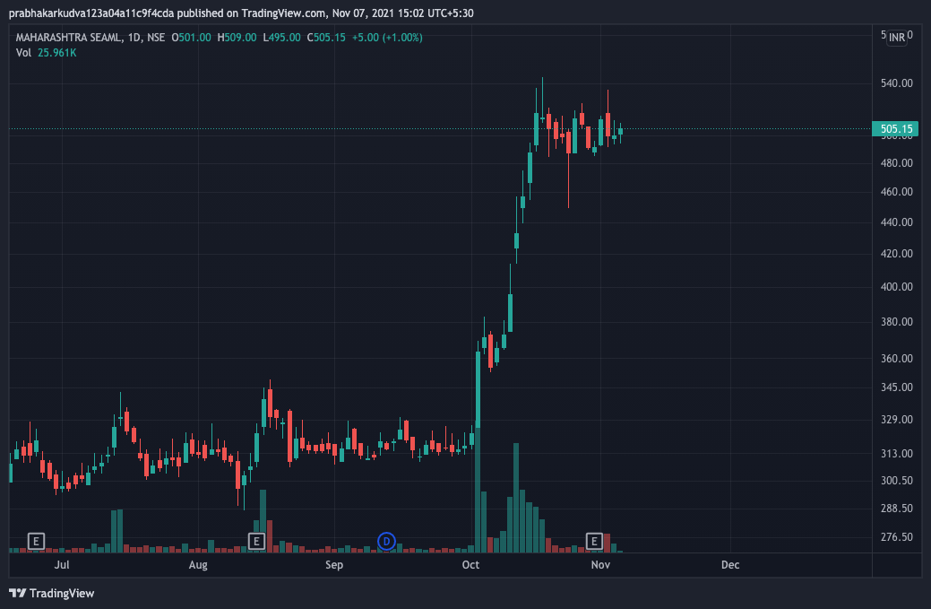
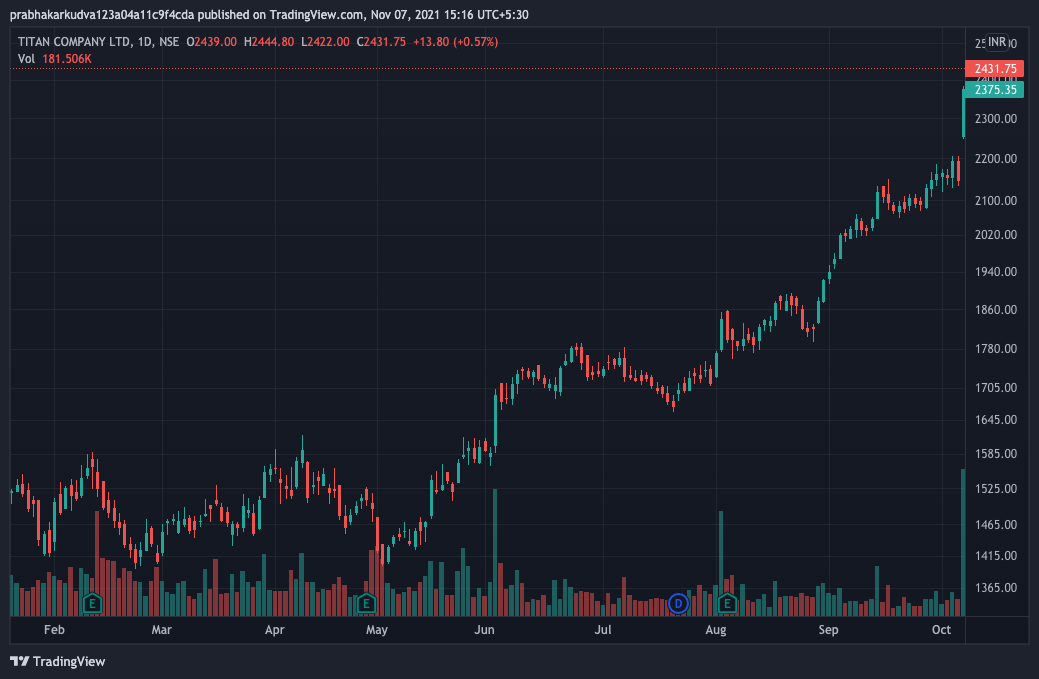
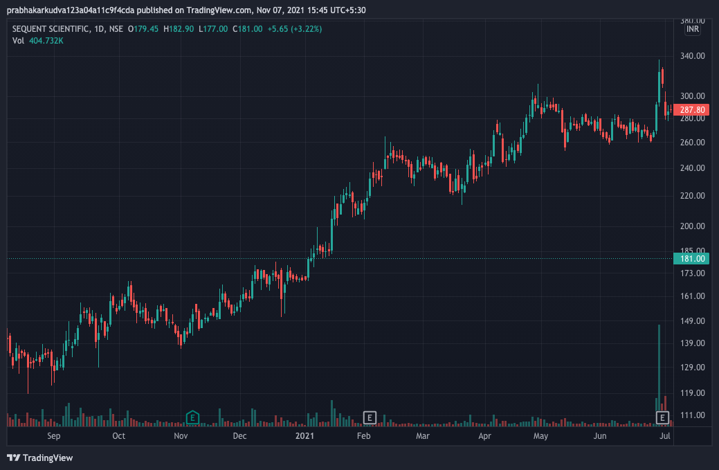
See below the same chart across time-periods.
A chart is basically the market’s view. Nothing more and nothing less. The chart doesn’t tell you if it’s the right view or wrong view. Just because the stock is in an uptrend doesn’t mean it HAS to go up. And if you’re bearish on the stock it doesn’t mean that your view is wrong. It is just what the market participants in that stock are doing. If tomorrow your view turns out to be correct the chart will change instantly. It will ignore all indicators, trend-lines and what have you. Nothing will matter. A bullish chart can change to bearish overnight.
So this is the first thing to understand - every chart is just a view on the stock. When you look at the chart you should be able to tell whether the current market view is bullish, bearish or neutral.
Next. Like i mentioned in one of the previous posts, every stock has a personality. To a large extent that personality is reflected in its chart. Charts are either linear and organised or bouncy and volatile. What i mean by this is the typical movements in the stock are either smooth or they are volatile. Figure out what type is it.
Look at the daily movements in the charts above - one of them moves violently with the highs and the lows wide apart while the other is much more predictable - no volatile moves and orderly movement. Now if you want to pick a stock to swing or position trade - which one are you better off with?
The nature of the chart may change depending on the environment. So the titan chart i have shown is linear but look at the same stock at other times.
So the chart tells us what mood the stock is in off late - which can be used for a variety of purposes but most importantly for allocation (for traders).
Next, we need to zoom in a little bit and understand what the stock is doing right now i.e. over the last few days/weeks. It will be doing one of the following:
Trending
Consolidating after a trending move
Pulling back after a trending move
Extended
Breaking out/down from consolidation
This is critical to plan the entries and exits if you need to do something right away.
Look at this chart.
Those big green candles - what are they? They are a pullback after a trending down move - which is a natural move. If you understand that you will not rush to buy it. When should you buy it? (NOT A RECCOMENDATION - JUST AN ILLUSTRATION) - once it goes into a breaking out from a consolidation phase.
This understanding also helps you anticipate what may happen to the chart. In this case what is likely? There are two possibilities once the stock bottoms - the price consolidates within some x% of the lows and then breaks out/further down or it snaps back up from a panic low and consolidates higher. Then the stock will wait for the next trigger to make its move.
Snap back up from the panic low is also known as seller exhaustion. This often happens at extremes where almost all the selling is exhausted and the stock bounces back 20% or more in quick fashion.
Each of the stages above have nuances which we possibly cant get into in this blogpost but it’s an extremely useful way to help you decide what to do if you need to take an action on a particular stock.
Last but one, look at the recent volume. Volume should be looked at in the context of the price move. If we’re early in a trend big volume is good, if we’re late in the trend big volume is not so good - but it doesn’t always mean the stock will fall . Also low volume during consolidations after an uptrend is considered good as it shows that the selling is not coming in even after a rise.
Finally, if you like how a stock chart looks - you have a good shot at predicting what other stocks in the same sector are likely going to do. This is an extremely powerful tendency. If a sector leader or even the number 2/3 starts trending the others in the sector will have charts which look like shit but they too will likely start trending - in the first phase. Then as the trend continues and earnings/news plays out divergences will start playing out - but that initial phase is almost a given. Hence any given chart can be used as an anticipation tool to make reasonable predictions about other charts in the same sector - in the initial phase. The same works on the way down. If you see a leading stock breaking down - start expecting its cousins to mimic the big brother. Works like a charm but as always nothing in the market is 100%. It’s all about probabilities.
Charts the graphical representation of events which should help us draw the probability curves for our stocks.


Good read. Thanks.